
Restaurant Logo Design
Creative Logo Design for FTR of Ellicottville
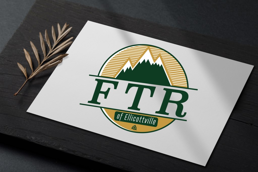
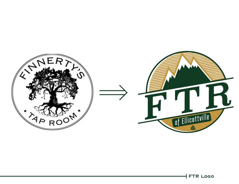
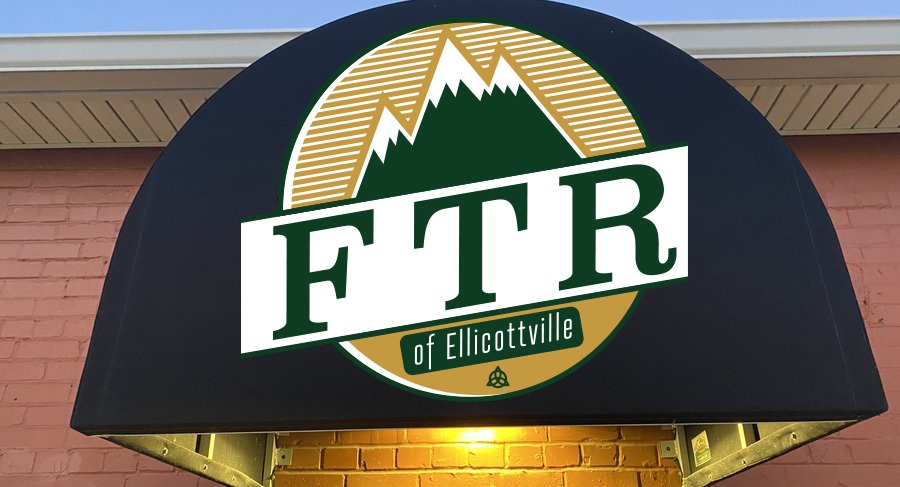
Finnerty’s Tap Room is a longstanding and popular restaurant in Ellicottville, New York. A change in ownership though, lead the restaurant to want a fresh start with a new restaurant logo design. DJC Graphic Designs was brought in to assist with this change to FTR of Ellicottville.
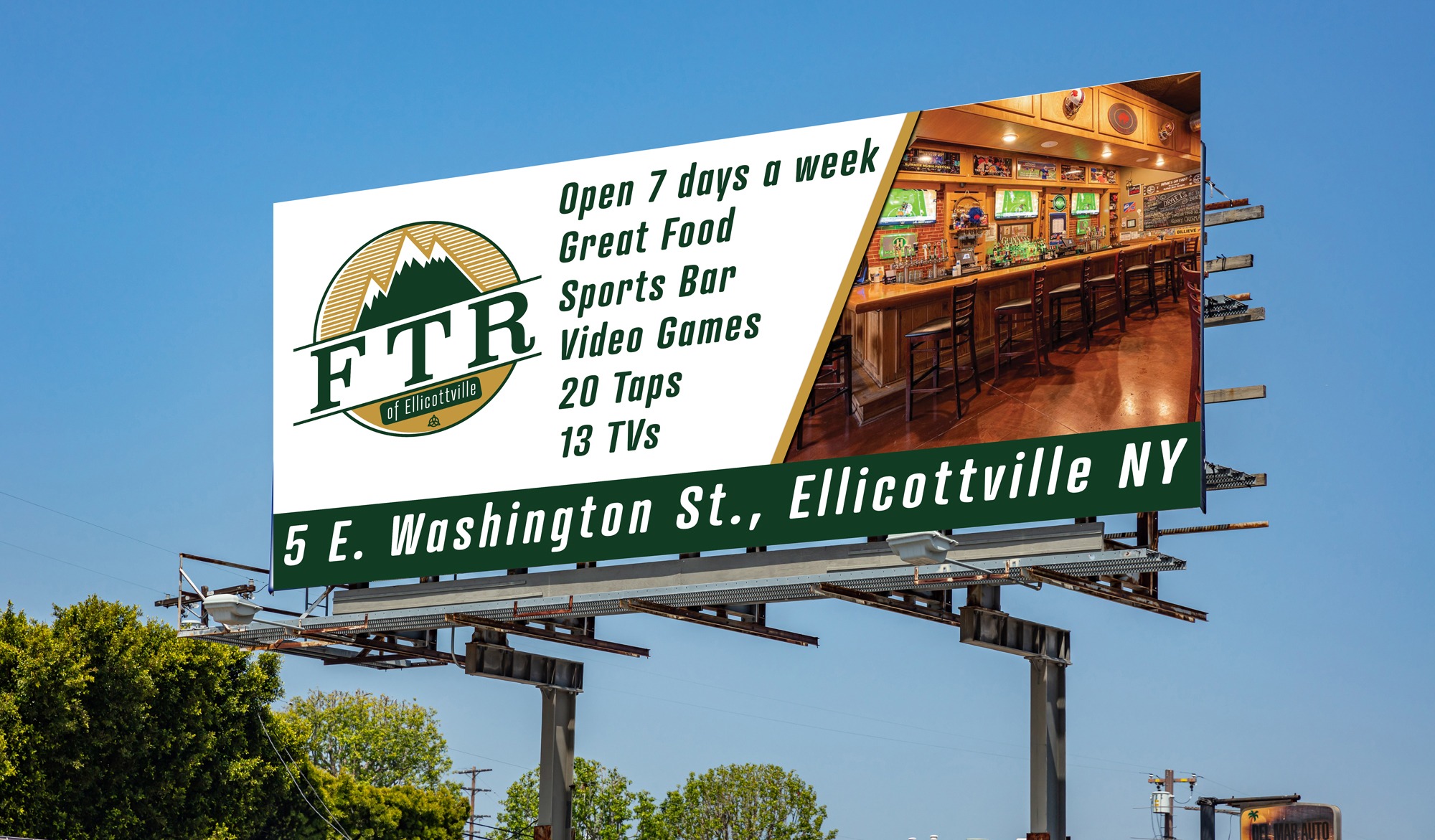
After the new restaurant logo design was launched, a further rollout of the new brand was ordered. This included a billboard campaign, focused on brand awareness in the region. Additionally, new on-site signage was produced, including a new awning over the restaurant entrance. Learn more about the restaurant logo design process.
Logo Design Introduction
The journey of crafting a cohesive and memorable restaurant identity is a crucial aspect of establishing a successful business in today’s competitive landscape. A restaurant’s logo is often the first point of interaction with potential customers, embodying the essence of the brand and its offerings. This article delves into the revitalization of the logo for FTR of Ellicottville, a local establishment, through the innovative work of DJC Graphic Designs. We will explore the logo redesign process, historical influences, and the profound impact this transformation has on brand perception and customer engagement.
The Logo Redesign Process
Understanding the Need for a New Logo
In an ever-evolving market, the visual representation of a restaurant must align with its identity, mission, and values. For FTR of Ellicottville, the need for a redesign stemmed from various factors, including outdated imagery, shifts in target demographics, and a desire to reflect a more contemporary and vibrant atmosphere. A logo that resonates with customers is essential for establishing a strong brand presence, one that encourages both new and returning clientele. The need for a fresh look became increasingly apparent as FTR sought to differentiate itself from competitors and reinvigorate its appeal.
Additionally, customer feedback played a vital role in this decision. Many patrons expressed that the previous logo lacked the warmth and personality that one would expect from a community-oriented restaurant. The redesign was thus not just an aesthetic change but a strategic move to align the brand more closely with the expectations and tastes of its audience.
Collaborative Approach between DJC Graphic Designs and FTR
The collaboration between FTR of Ellicottville and DJC Graphic Designs was marked by an open dialogue and creative synergy. This partnership enabled an in-depth exploration of FTR’s vision, values, and the customer experience they aimed to foster. The design team at DJC started with comprehensive market research, analyzing trends within the restaurant industry and understanding the local demographic to create a design that truly resonates.
Workshops and brainstorming sessions were organized, allowing both teams to express ideas and feedback openly. This cooperative approach ensured that the final design was a true reflection of FTR’s identity while incorporating innovative design principles. The importance of collaboration cannot be overstated, as it allowed for a diverse array of perspectives to shape the logo’s direction.
Key Elements of the New Restaurant Logo Design
The new logo design for FTR of Ellicottville incorporates several key elements that contribute to its effectiveness. Firstly, color selection plays a pivotal role, evoking emotions and setting the overall tone of the brand. The palette chosen reflects the natural beauty of Ellicottville, incorporating earthy tones that resonate with the environment. These colors not only enhance aesthetic appeal but also foster a sense of belonging among the local community.
Moreover, the typography chosen for the logo is modern yet retains a level of sophistication, ensuring legibility across various formats. The inclusion of local imagery—such as mountains or culinary items—adds a layer of connection to the region and celebrates its unique heritage. Every element in the design has been meticulously chosen to reflect FTR’s values and mission, from the font style to the symbolic graphics, ensuring a holistic representation of the brand.
Historical Influence on the Logo
Exploring Ellicottville’s Rich History
Ellicottville is a location steeped in rich history, serving as a hub for both tourism and local culture. As such, the new logo for FTR draws heavily from this historical context. Understanding the town’s evolution—from its roots as a mill town to its current status as a vibrant recreational destination—was crucial in framing the logo’s narrative. The local community has a deep connection to its heritage, and this was an important aspect to consider during the design process.
By integrating historical elements into the logo, FTR not only pays homage to its locality but also creates a narrative that resonates with residents and visitors alike. These elements serve as a reminder of the community’s legacy and the collective identity that FTR aims to reflect through its branding.
Incorporating Local Heritage into the Design
The incorporation of local heritage into the design of the new logo is evident in various aspects, including iconography and symbolism. DJC Graphic Designs worked closely with FTR to identify elements that truly represent Ellicottville’s identity—whether it’s natural motifs like trees and mountains or traditional symbols that reflect the restaurant’s culinary style.
This thoughtful integration helps to create an emotional connection between the brand and its audience, invoking feelings of nostalgia and community pride. The logo becomes more than just a visual representation; it transforms into a narrative that celebrates the town’s heritage while emphasizing FTR’s role within it.
The Significance of Historical Elements in Branding
Historical elements in branding are significant as they help to establish authority and authenticity. Customers are increasingly drawn to brands that tell a story, and a logo that encapsulates a rich history can create a sense of trust and loyalty. The new logo for FTR stands as a testament to Ellicottville’s past while positioning the restaurant as a contemporary player in the local dining scene.
Additionally, such elements can enhance brand recognition. A logo that resonates with a community’s historical identity can lead to greater word-of-mouth marketing, as locals share their affinity for the brand, thereby attracting new customers who are curious about its story. It bridges the gap between tradition and modernity, appealing to both long-standing locals and newcomers alike.
Impact of the New Logo
Perception Changes Among Customers
The introduction of the new logo has led to noticeable changes in customer perception. Many patrons have expressed that the updated design feels more inviting and representative of the atmosphere they experience within the restaurant. This shift is crucial, as a logo serves as a vital touchpoint in a customer’s journey, influencing their initial impressions and ongoing relationship with the brand.
As customers become more familiar with the new logo, there has been a marked increase in engagement on social media platforms, with patrons sharing images of the logo and expressing their excitement about the change. This indicates a positive reception and an evolving customer narrative that aligns closely with the restaurant’s branding efforts.
Enhancing Brand Recognition and Loyalty
With the revamped logo, FTR has effectively enhanced its brand recognition within the community. A well-designed logo acts as a visual anchor, making it easier for customers to recall the brand amidst a sea of competitors. The distinctive features of FTR’s new logo, combined with its narrative elements, have contributed to a more robust brand identity that customers can easily associate with positive dining experiences.
Furthermore, brand loyalty is nurtured through consistency and emotional connection. As customers resonate with the story behind the logo and the values it represents, they are more likely to develop a sense of loyalty to the restaurant. This emotional tie not only fosters repeat visits but also encourages patrons to become advocates for the brand within their social circles.
Conclusion
Summary of the Redesign Journey
The redevelopment of the logo for FTR of Ellicottville stands as a compelling case study in how thoughtful design can rejuvenate a brand. From understanding the need for a modern logo to collaborating closely with DJC Graphic Designs, every step taken was deliberate, ensuring that the end product would resonate deeply with both the community and visitors. The historical elements woven into the design serve as a reminder of the rich legacy of Ellicottville, thus enhancing the restaurant’s identity.
The Importance of Continuous Evolution in Restaurant Branding
As the restaurant industry continues to evolve, so must the brands within it. The transformation of FTR’s logo illustrates the necessity for businesses to adapt, ensuring their identity remains relevant and engaging to customers. Continuous evolution in branding is essential not only for maintaining customer interest but also for fostering a deeper connection with the community. As FTR moves forward, it embodies a brand that honors its past while embracing the future, paving the way for sustained success and growth in the competitive culinary landscape.