Your logo is the front door to your small business. While your logo does not say everything about your business, it does tell customers a lot. It’s important to give your customers the right impression. What are some common mistakes when beginning the process to design a logo for a small business? Let’s look deeper.
The Do's & Don'ts When You Design a Logo
Don't: Think that the Papyrus typeface is a logo

I get it. It’s a little different looking. Maybe you think it’s exotic. The Siren Song of Papyrus is calling your name.
“Maybe this is what will fix my business.”
“Maybe this will get attention. All attention is good attention, right?”
NO!
Just because this typeface looks different doesn’t mean it’s right for you. Papyrus was created with a specific intent in mind. As the inventor, Chris Costello, says “I was thinking a lot about the Middle East, then, and Biblical Times”. Unless your small business logo design has roots in this, avoid it! Think about what your small business stands for and how this can relate to your logo.
Do: Keep your logo simple
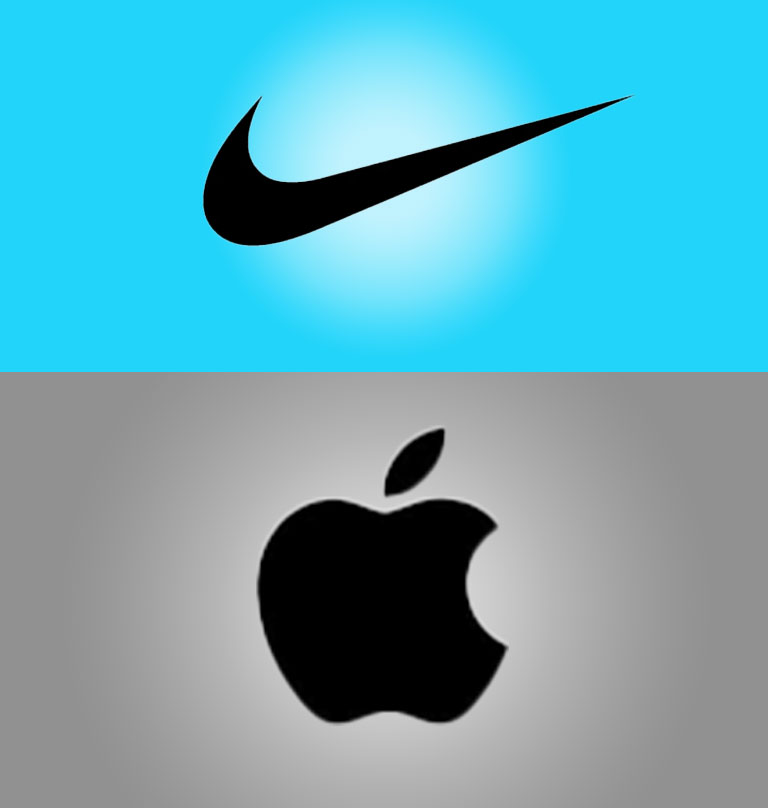
Think about the best logos. Nike. Apple. McDonalds. Target. These are deceptively simple logos. They consist of simple shapes and clean lines. How is your small business logo viewed by customers? Could you mention your business by name and people can instantly describe your logo?
While it is not reasonable to expect any business to get to the profit level of those businesses, it is reasonable to expect your business logo to resonate with customers. Think of simple shapes. Simple icons. What can best represent your small business at a quick glance?
Don't: Use too many colors in your logo design
The more colors in your logo, the greater the chance it gets lost in a customer’s mind. Again, think of the best logos. In addition to simple shapes, colors are limited to a primary color and a few secondary colors. The ultimate goal for your business logo is to have customers able to recall it. Having customers that can quickly think of you is free advertising! Make sure your logo is working for you.
Do: Make sure your business name is readable
If your business name is in the logo (it should be), make sure customers can read it! This might seem like obvious advice, but the number of small businesses that fall victim to this is staggering. Customers need to see your business. They need to recognize you! Whether this is on your storefront for your business, in an advertisement or on a sign, don’t make customers work to know who you are!
People are overwhelmed with endless amounts of information and images each day. Make sure your logo is clean and clear.
Don't: Assume your logo needs to be literal!
If your business is John’s Landscaping, your logo doesn’t need to be an illustration of you pushing a lawn mower. Your pizzeria doesn’t need to feature the Italian chef in the huge hat. Think about what your business represents. Think about the image you want to give your customers. Make sure the impression you are given them with your logo and graphic design is the right one.
Do: Choose a typeface that represents your business image
Is your business modern and contemporary? A san-serif typeface like Avenir or Sofia may be the right choice for your business. Does your business need to convey strength? A slab-serif typeface like Rockwell could be right choice. A traditional serif typeface can convey legacy and history to your brand.
All of these choices come together to create one of the most important pieces of marketing for your small business. Have more questions? Reach out and let’s talk!